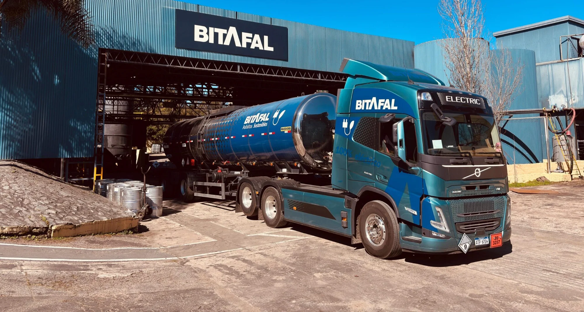
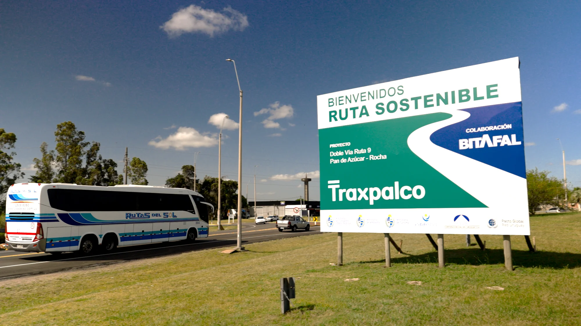
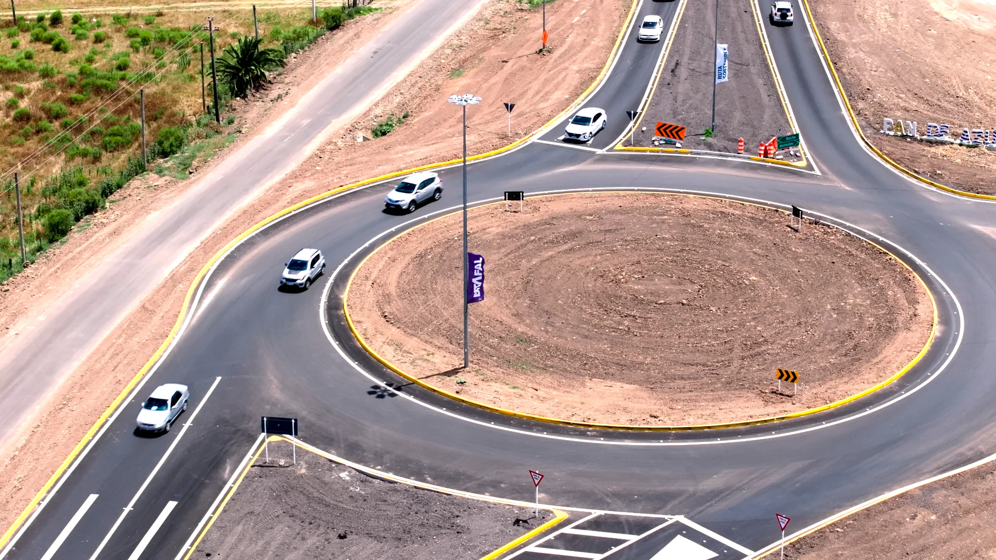
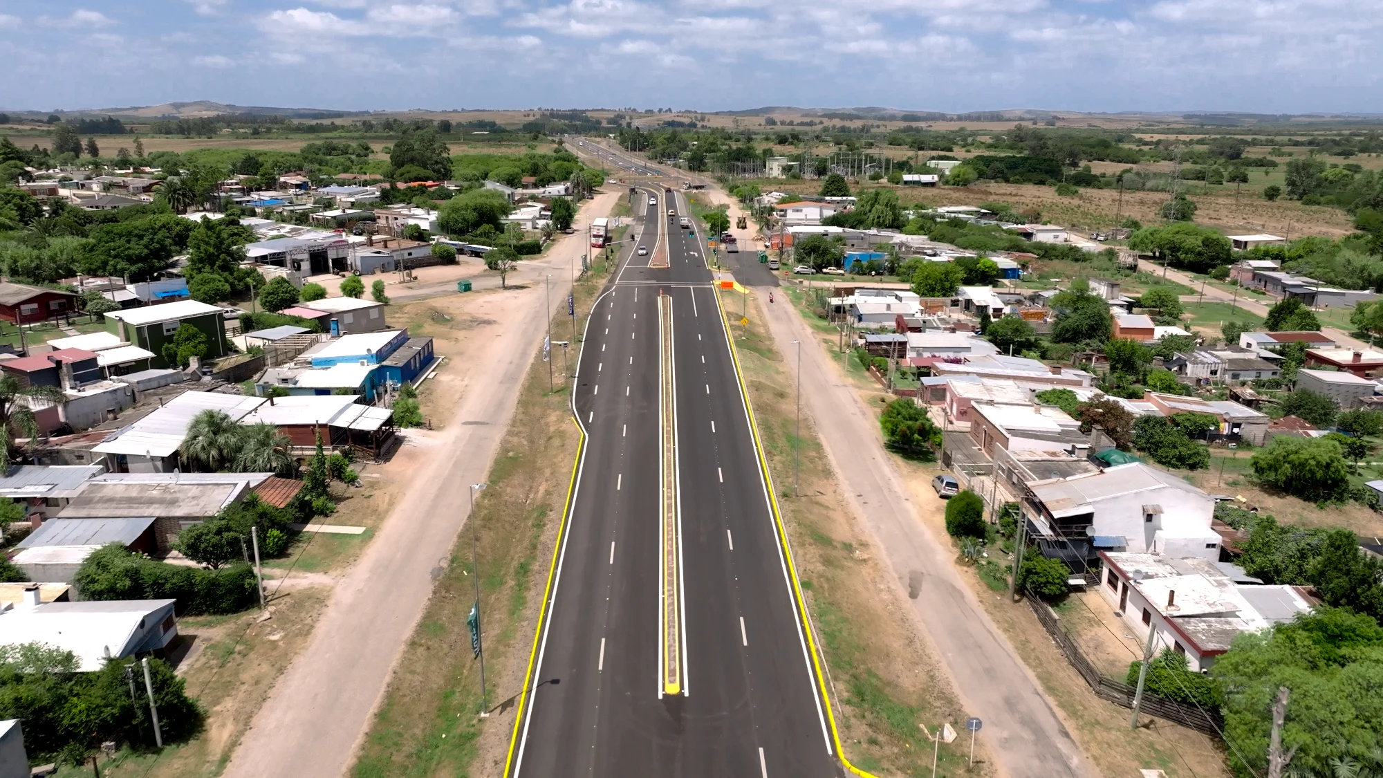
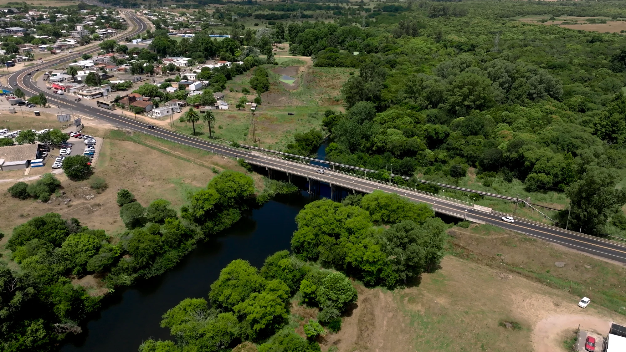
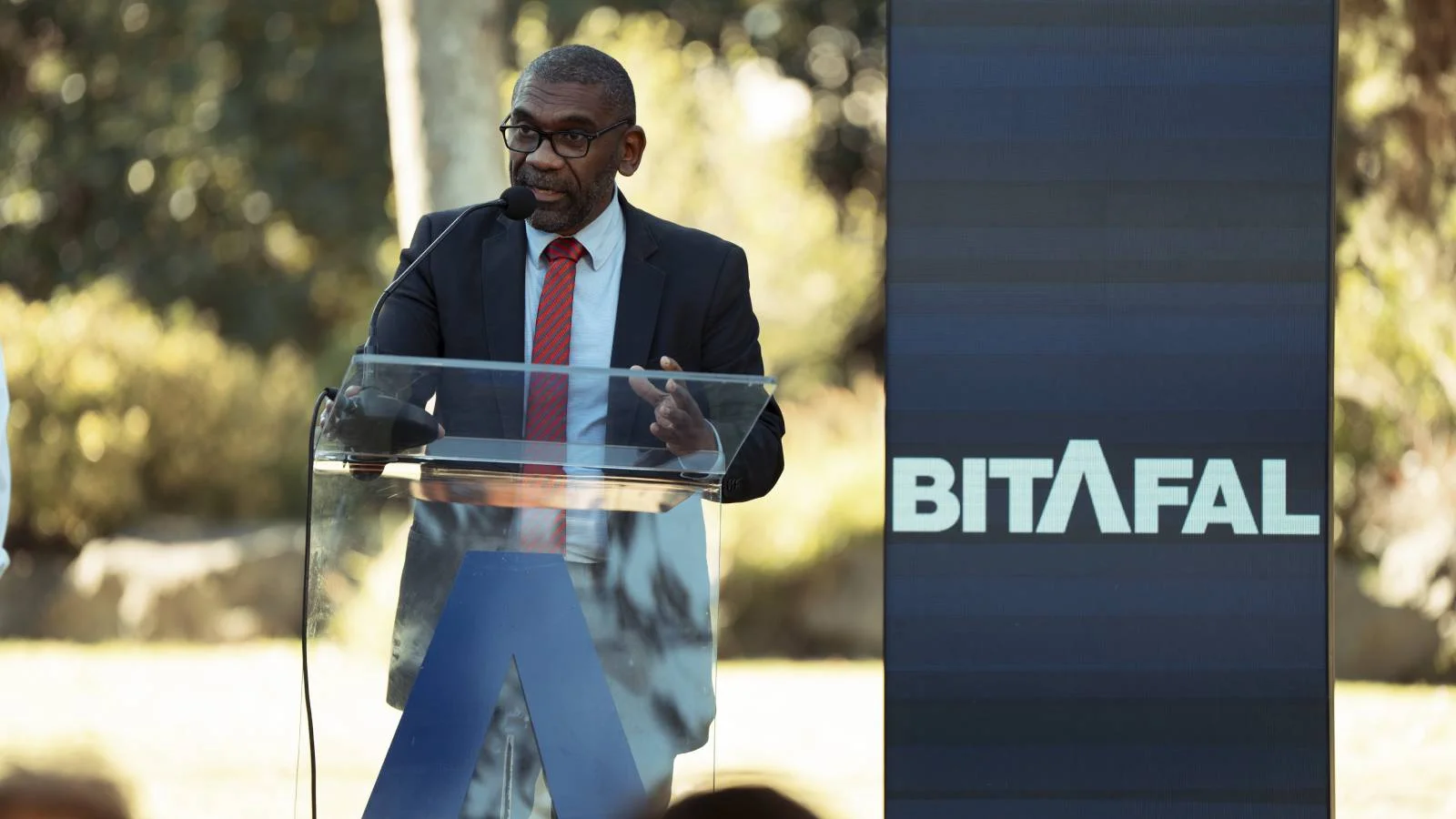
Bitafal's new identity does what a good road does: it gets straight to the point. The wordmark keeps the company name legible and confident, but the A at its center rises and stretches into a single, uninterrupted line — a highway disappearing into the horizon. One color. No clutter. No noise. Just BITAFAL, simple, solid, and built to last — just like the roads they make.